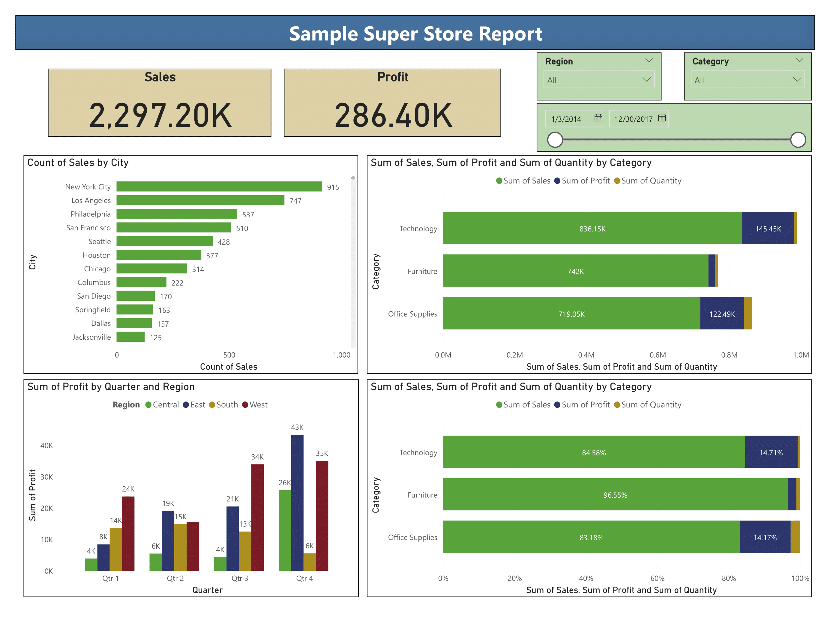
Card, Slicer and Bar Charts Visuals in Power BI Visuals
The following dashboard uses the Sample - Superstore dataset to demonstrate the creation of:
- Slicer
- Slicers are visuals that filter data in the report through one or more fields.
- By default slicer filter data on the same report page, however; through sync slicers pane from View ribbon slicer can filter data on all or selected report pages.
- Data Card
- Card visuals displays the aggregated information of a single numeric value.
- Simple Bar Chart
- Bar or Column chart is used to display categorical or discrete data.
- The primary variable is categorical in nature e.g. City, State etc. while the secondary variable will be numeric in nature e.g. count of sales, sum of profit etc.
- Stacked Bar Chart
- Stacked bar chart is similar to simple bar chart but it is used to show comparisons between categories of data, and with the ability to break down and compare parts of a whole.
- Clustered Column Chart
- Clustered or group column chart is used for comparing multiple sets of data over the same categories e.g. sum of profit of different regions for all financial quarters.
- 100% Stacked Bar Chart
- 100% stacked bar chart has the same concept but instead of actual figures it shows comparison in percentage.

0 comments:
Post a Comment