ZamaCode

Code never lies, comments sometimes do [Ron Jeffries]

Visitors Map

Follow on Twitter

@ZammaCode
Powered by Blogger.

Tuesday, June 13, 2023

Context in DAX


  • Context describes the environment in which a DAX formula is evaluated. 
  • There are two types of context.
  • Filter Context
    • Filter context is the context that is applied to a whole table or column (set of rows).
    • The filter context is set of filters that are applied to the data model before the evaluation of a DAX statements starts. 
    • Filter context is usually created by visual, slicer, page or whole report. 
    • For instance, the formula AverageSales = AVERAGE(Sales[Total Sales]) will use the filter context to calculate the average of the Total Sales column.
    • The CALCULATE function can be used to change the assigned Filter context.
    • The initial filter context coming from the visual is applied to the underlying table(s) in the data model and automatically propagates from the "one" side of the relationship to the "many" side of the relationship i.e. from the lookup table to the data table.
    • In the following example the filter applied on Products table can propagate downhill to the Sales table but cant not flow back uphill to Customers table.

  • Row Context
    • Row context is the context that is applied to each individual row of a table when a formula is evaluated.
    • The row context is created by default for calculated columns, some formulas like iterators (X functions), and FILTER() function, while all other scenarios will require you to create the row context e.g. in the case of Measures.
    • Row context does not filter the table. To turn the row context into filter context you can use the CALCULATE() function.
    • Row context cannot use relationship, therefore;  RELATED() and RELATEDTABLE() functions allow a row context to leverage an existing relationship.
    • For instance, when evaluating a formula like TotalSales = Sales[Quantity] * Sales[Price], the calculation will be performed for each row, resulting in the TotalSales value for each individual row.

Monday, June 12, 2023

What is Data Modeling in Power BI


  • A Data model is a collection of data, tables, relationship between different tables, formatting rules, calculations/measures, and hierarchies.
  • Power Pivot is used for data modeling in Power BI.
  • The first step of data modeling is loading of data from Power Query, which are stored in tables in the form of columns. 
  • A single column usually primary key column is used to define relationships, in Power BI only one-to-many and one-to-one relationships are supported. In Power BI relationships are used for filtering rather than for normalization.
  • Formatting rules are used to format the imported data as per our required format for reporting and analysis.
  • Measure is a calculated value or expression that performs some calculation on the data to derive meaningful insights.
  • Hierarchies in Power BI are a way to organize data in a hierarchical structure. This allows users to drill down from parent levels to lower levels in a specific order. A common hierarchy might be over date data that creates a three-level hierarchy over year, month, and day.

What is Data Analysis Expressions (DAX)


  • DAX is a functional and, query language.
  • Functional means DAX primarily use functions to generate results.
  • Query means DAX can only filter or query data from table in Power BI, SSAS Tabular or PowerPivot.
  • DAX is used in:
    • Measures
      • Measure is a calculated value or expression that performs some calculation on the data to derive meaningful insights.
    • Calculated columns
      • Calculated column is a column that is created in a table by defining a DAX formula or expression. 
    • Calculated tables
      • Calculated table is derived from calculations based on existing tables or columns in the data model. 
    • Row-level security
      • In Row-level security the DAX formulas are used for creating an allowed row set.


Sunday, June 11, 2023

xVelocity


  • With the introduction of Microsoft SQL Server 2012, a cutting-edge technology called xVelocity was unveiled, revolutionizing the way data is processed in-memory.
  • In the realm of Data Warehousing, the xVelocity memory-optimized columnstore index offers an exceptional acceleration for frequently encountered data warehouse queries. 
  • For Business Intelligence purposes, xVelocity introduces an advanced in-memory analytics engine seamlessly integrated into SQL Server Analysis Services (SSAS). This integration translates into quicker access to insights, enabling you to derive valuable information in significantly less time. Even on typical industry hardware, the system showcases remarkable scan rates, processing tens of billions of rows per second.

Wednesday, May 31, 2023

Data Connection Methods in Power BI


There are three different ways to connect to data sources in Power BI.

  • Import Data
    • In this method Power BI extracts data from source and stores it in the in-memory engine called xVelocity. xVelocity engine is optimized for data storage and performance.
    • Import data offers superior performance and enhances the overall design experience.
  • DirectQuery
    • In DirectQuery Power BI directly connects with the data source and no data is imported into Power BI. 
    • DirectQuery has certain limitations, including the lack of support for certain data sources and the incomplete compatibility with all Power Query features.
    • DirectQuery provides scalability and enables seamless data updates.
  • Live Connection
    • Similar to DirectQuery, Live connection in Power BI does not involve importing data into the Power BI. 
    • However, Live connection surpasses DirectQuery in terms of query performance, primarily because it exclusively supports Microsoft data sources such as SQL Server Analysis Services database, Azure Analysis Services database, and Power BI datasets.
    • Live connection provides performance, scalability, and enables seamless data updates.


Monday, May 29, 2023

Table, Matrix, Key Influencers, Decomposition Tree Visuals


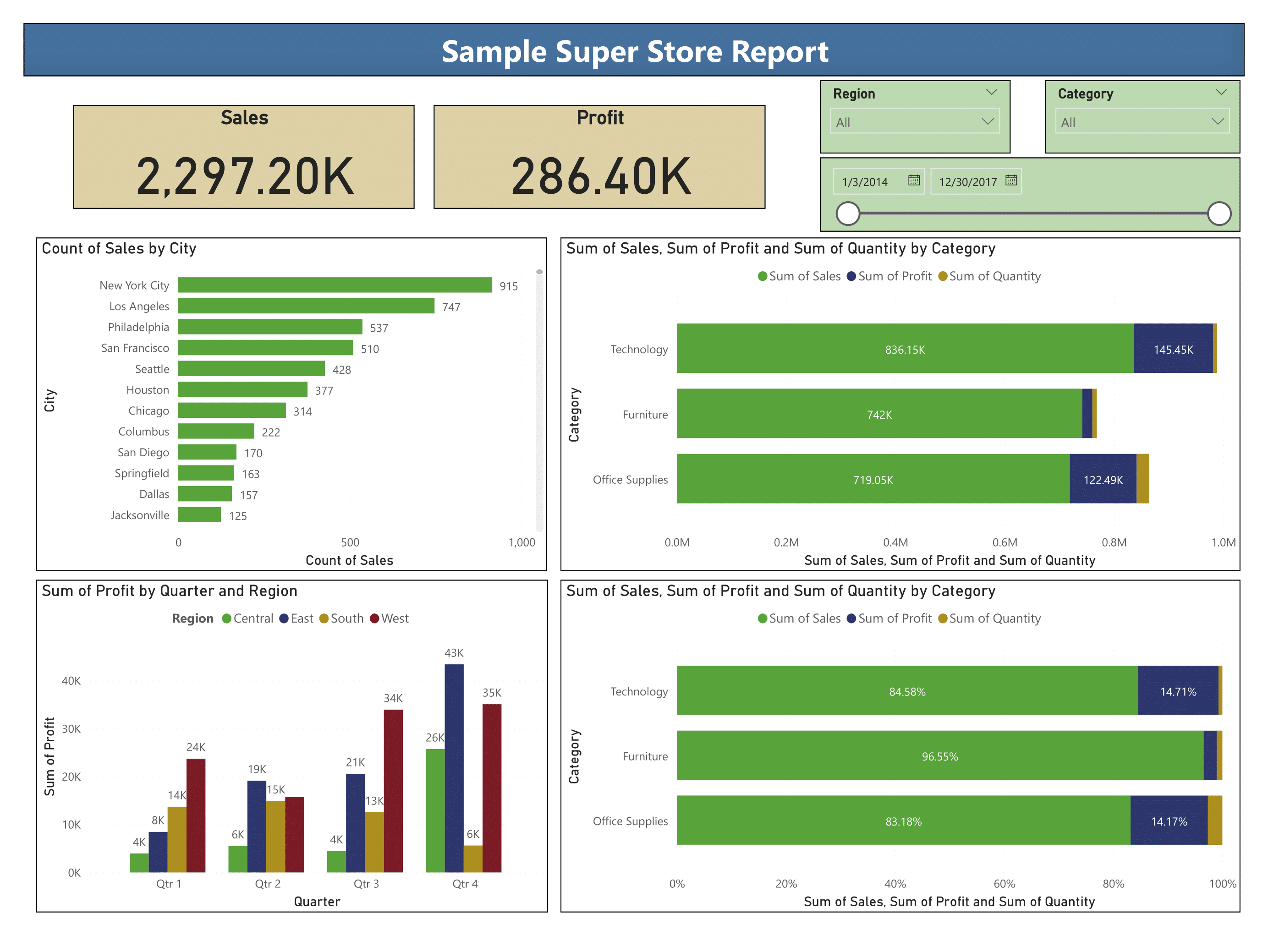
 The following dashboard uses the Sample - Superstore  datasets to demonstrate the creation of:

  • Table
    • The Table visual is a grid where related data is displayed in 2D format i.e. rows and columns.
    • Table visual is flat, means duplicate values are displayed and not aggregated.
    • Tables are great for quantitative comparisons where you compare multiple values from different categories.
    • In Power BI the following fields are shown in details pans:
      • Columns defines the columns to be added to table
  • Matrix
    • The Matrix visual is similar to table but it can display data in multiple dimensions.
    • The Matrix aggregates the data itself and lets users drill down.
    • In Power BI the following fields are shown in details pans:
      • Row field defines the data that need to be shown in rows
      • Column field defines the data that will represent columns of matrix
      • Values define the numeric data that needs to be aggregated
  • Key Influencers
    • The Key influencers visual shows the top contributors to the selected metric value.
    • Key influencers makes use of Regression analysis.
    • In Power BI the following fields are shown in details pans:
      • Analyze field identifies the data that needs to be analyzed
      • Explain by are factors that influence the analyze field
      • Expand by field is used when analyzing a measure or summarized field
  • Decomposition Tree
    • A decomposition tree visualizes data in its components or building blocks. 
    • Decomposition tree visualize data across various categories and dimensions and allows to drill down into the data for in-depth analysis.
    • In Power BI the following fields are shown in details pans:
      • Analyze field identifies the data that needs to be analyzed
      • Explain by fields that are used to analyze or drill-down the data

Download PBIX file


Friday, May 26, 2023

Map, Filled Map, Gauge, Multi-row Card, KPI Visuals


The following dashboard uses the Sample - Superstore and Financial Sample datasets to demonstrate the creation of:

  • Map
    • Map enables to track and analyze data on a geographic level.
    • Map is integrated with Bing Maps to provide default map coordinate (called geo-coding).
    • Map visual displays points that can be scaled as area bubbles.
    • In Power BI the following fields are shown in details pans:
      • Location specify the country, city or state columns
      • Legend provides additional context or information about the data being displayed on the map
      • Latitude and Longitude specify exact coordinates
      • Bubble size specify the size of data point or bubble on the map which is usually a numeric field e.g. sum of profit
  • Filled Map
    • Filled map displays quantitative information using filled regions or polygons.
    • In Power BI the following fields are shown in details pans:
      • Location specify the country, city or state columns
      • Legend sub-categorize the data 
      • Latitude and Longitude specify exact coordinates
  • Gauge
    • Gauge or radial gauge chart shows a single value that measures progress toward a goal or a Key Performance Indicator (KPI).
    • The line or needle represents the target value while shading represents the progress toward that goal.
    • In Power BI the following fields are shown in details pans:
      • Values specify the value to be displayed e.g. average of sales
      • Minimum Value specify the minimum value for the gauge 
      • Maximum Value specify the maximum value for the gauge
      • Target Value specify the target value to be achieved
  • Multi-row Card
    • Multi-row Card visuals displays the aggregated information of a multiple numeric values in group format.
    • In Power BI the following fields are shown in details pans:
      • Fields specify the columns which are to be shown in the group on multi-row card
  • KPI
    • KPIs (Key Performance Indicators) tracks an organization’s performance in different areas toward defined targets.
    • A KPI always has a base value which is evaluated against a target value.
    • In Power BI the following fields are shown in details pans:
      • Value specify the base value that has to be evaluated
      • Trend Axis specify the time
      • Target specify the target or goal value that needs to be achieved
    • For visual SalesKPI table is created in PowerBI. 

Wednesday, May 24, 2023

Waterfall Chart, Funnel Chart, Scatter Chart, Pie Chart, Donut Chart, Treemap Visuals


 The following dashboard uses the Sample - Superstore dataset to demonstrate the creation of:

  • Waterfall Chart
    • Waterfall chart visualizes positive and negative changes to a value or displays each individual component that contributes to the final value.
    • In waterfall chart there is a starting bar that represents the initial value then we have floating bars in space that represent positive and negative changes to that initial value. Lastly, an ending bar represents the final value and takes into account the effects of all the displayed transitional values.
    • The starting and ending bars both start with baseline of zero while the floating middle bars have their own baseline, which is the previous bar’s end.
    • In Power BI the following fields are shown in details pans:
      • Category specify a chart trend usually a time-based column e.g. year
      • Breakdown specify the column in which changes are required to be explored e.g. category
      •  Y-axis specify the numeric values that needs to be plotted e.g. sum of sales
  • Funnel Chart
    • Funnel chart visualizes progression or movement of data through different stages e.g. sales funnels, recruitment processes or order fulfilment processes.
    • It can be used when you have 3 or more stages to visualize and data diminishes at each stage.
    • In funnel chart the top most bar (aka “head” or “base” of the funnel) represents 100 percent data. The subsequent bars have lengths representing the proportion to the whole.
    • In Power BI the following fields are shown in details pans:
      • Category specify stages e.g. shipping mode
      • Values specify data e.g. total sales 
  • Scatter Chart
    • Scatter chart visualizes the relationship or association between two quantitative variables e.g. how does global oil prices affect a country’s GDP?
    • In Power BI the following fields are shown in details pans:
      • Values specify the categorical column e.g. sub-category
      • X-axis specify the horizontal-axis column e.g. sum of sales
      • Y-axis specify the vertical-axis column e.g. sum of profit
      • Legend specify which column to sub-divide the whole data e.g. category
      • Size specify column on the basis of which size of dots is defined e.g. sales
      • Play axis specify the column for trend over time usually a date column
  • Pie Chart
    • Pie chart displays categorical data in a circular graph. The entire “pie” represents 100% of a whole, while the pie “slices” represent portions of the whole.
    • Primary objective of a pie chart should be to compare each group’s contribution to the whole.
    • In Power BI the following fields are shown in details pans:
      • Legend specify which column to sub-divide or slice the whole data e.g. category
      • Values specify the numerical column e.g. sum of sales
      • Details specify further column to sub-divide or slice the data
  • Donut Chart
    • Donut chart is a pie chart with its center cut out to look like a donut.
    • In Power BI the following fields are shown in details pans:
      • Legend specify which column to sub-divide the whole data e.g. category
      • Values specify the numerical column e.g. sum of sales
      • Details specify further column to sub-divide or slice the data
  • Treemap
    • Treemap chart displays large amount of hierarchical data using rectangles of decreasing sizes.
    • Rectangles in the treemap are arranged according to size.
    • Tree map visualize a part-to-whole relationship among a large number of categories.
    • A pie chart might best work with three or fewer segments, a treemap works well with many.
    • In Power BI the following fields are shown in details pans:
      • Category specify the categorical column and define structure of the treemap e.g. sub-category
      • Values specify the numeric column and define size or color of the individual rectangles e.g. sum of profit
      • Details specify further column to sub-divide the data


Thursday, May 18, 2023

Line Chart, Area Chart, Stacked Area Chart, Line & Stacked Column Chart, Line & Clustered Column Chart, Ribbon Chart Visuals


 The following dashboard uses the Sample - Superstore dataset to demonstrate the creation of:

  • Line Chart
    • Line chart depicts data which changes over the time e.g. showing the difference in profit over the time. 
    • The horizontal axis shows the continuous values e.g. week, month or year etc. 
    • The vertical axis shows the changes in data points we are interested in. This will be a statistical summary like a total or average.
  • Area Chart
    • Area chart chart combines line and bar chart to show changes in data over time. 
    • The area chart uses transparent shading to show crossover.
    • Area chart is used with multiple lines to show trend over the time or make a comparison between categories or groups e.g. comparing the profit and sales over the time.
  • Stacked Area Chart
    • Stacked area chart stacks multiple areas on top of each other. 
    • The area chart uses solid colors to show crossover.
    • The topmost line in stacked area chart will always represent the total when summing all the groups.
    • Stacked area chart is used to track not only the total value, but also to understand the breakdown of that total by categories or groups.  e.g. analyzing the yearly sales.
  • Line and Stacked Column Chart
    • Line and stacked column chart combines the stacked column and line charts. 
    • By combining stacked column and line visuals, we can make a quick comparison between two categories. E.g. comparing total sales and profits of different categories with line shows the trend of discount for each category. 
  • Line and Clustered Column Chart
    • Line and clustered column chart is the combination of line and clustered column chart.
    • Just like clustered column chart it displays and compare multiple sets of data over the same categories along with line to shows the trend. E.g. total sales of different regions for all financial quarters with line showing trend of total profit over the quarters.
  • Ribbon Chart
    • Ribbon Chart is a stacked column chart combined with line chart but with one difference that is in stacked column chart categories are shown in the order it added to the axis; However, in Ribbon chart categories are ordered which has the highest value (rank).

Download PBIX file


Wednesday, May 17, 2023

Card, Slicer and Bar Charts Visuals in Power BI Visuals


 The following dashboard uses the Sample - Superstore dataset to demonstrate the creation of:

  • Slicer
    • Slicers are visuals that filter data in the report through one or more fields.
    • By default slicer filter data on the same report page, however; through sync slicers pane from View ribbon slicer can filter data on all or selected report pages.
  • Data Card
    • Card visuals displays the aggregated information of a single numeric value.
  • Simple Bar Chart
    • Bar or Column chart is used to display categorical or discrete data. 
    • The primary variable is categorical in nature e.g. City, State etc. while the secondary variable will be numeric in nature e.g. count of sales, sum of profit etc.
  • Stacked Bar Chart
    • Stacked bar chart is similar to simple bar chart but it is used to show comparisons between categories of data, and with the ability to break down and compare parts of a whole.
  • Clustered Column Chart
    • Clustered or group column chart is used for comparing multiple sets of data over the same categories e.g. sum of profit of different regions for all financial quarters.
  • 100% Stacked Bar Chart
    • 100% stacked bar chart has the same concept but instead of actual figures it shows comparison in percentage.

Download PBIX file 


Tuesday, May 16, 2023

What is Power BI


  • Power BI is a business analytics and data visualization tool developed by Microsoft. 
  • Power BI is available in several versions:
    • Power BI Desktop; for creating reports and visualizations
    • Power BI Service; for sharing and collaboration
    • Power BI Mobile; for accessing and interacting with reports on mobile devices
  • Key features of Power BI include:
    • Data Connectivity
      • Power BI offers a wide range of connectors to connect to various data sources such as databases, cloud services, spreadsheets, and more. 
    • Data Transformation
      • Users can shape and transform data using Power Query, a data preparation tool within Power BI. 
      • It allows for data cleansing, merging, splitting, and other data transformation operations.
    • Data Modeling
      • Power BI provides a data modeling capability through Power Pivot, allowing users to create relationships between different tables, define calculations/measures using formulas, and create hierarchies to analyze data.
    • Visualizations
      • In Report View users can create interactive and visually appealing dashboards and reports using a wide range of customizable visual elements such as charts, graphs, tables, and maps. 
    • Collaboration and Sharing
      • Power BI allows users to share their dashboards and reports with others within their organization through workspace and Microsoft Teams.
    • Data Security
      • Power BI offers robust security features, including role-based access control, row-level security, and data encryption, to ensure the confidentiality and integrity of data.
    • Integration
      • Power BI seamlessly integrates with other Microsoft products and services, such as Excel, Azure, and SharePoint. 

The following diagram depicts the relationship between different Power BI components.


Friday, February 28, 2014

IPv4 Network Classes


IPv4 addresses are divided into three groups:

Unicast Addresses

It includes Class A, B and C. Firs octet most significant bit identifies the class of IP address.
  • Class A IP addresses first octet start with 1-126.The first octet has a format 0xxxxxxx,where 0 identifies that it is Class A. 
  • Class B IP addresses first octet start with 128-191.The first octet has format 10xxxxxx, where 10 identifies that it is class B.
  • Class C IP addresses first octet start with 192-223.The first octet has format 110xxxxx, where 110 identifies that it is class C.

Multicast Addresses

It includes Class D.
  • Class D IP addresses first octet start with 224-239.

Experimental Addresses

It includes Class E. These addresses are only used for experimental purposes and its first Octet start with
240-255.

Table lists the different facts about Class A, B and C networks.

  • Network Number/ID is the lowest number in the network
  • Total networks are the available number of networks in one class, it can be calculated by 2^network_bits. It must be noted that network bits are always one, two and three bit less; it is because the Class A reserve 1-bit, Class B reserve 2-bits and Class C reserve 3-bits for the identification of class.
  • The mask communicates the network and host parts of the IP address to the computer, therefore; every Class has its associated default subnet mask.
  • Broadcast Address of a Class is the numerically highest number in network. Routers forward a copy of packet with broadcast address as destination to all hosts in Classful network.
  • In between Network ID and Network Broadcast Address is the range of Usable IP Addresses. It can be calculated by 2^h-2. Two addresses (namely; network ID and broadcast address) are subtracted from the total available addresses as there addresses can't be used for hosts/nodes.

To find then network ID, Network Broadcast and Usable Address for an IP Address follow the following steps: 

  1. Determine class of the IP address by examining first octet.
  2. Divide the IP address into network and host part.
  3. To find network ID, change host part octets to 0.
  4. To find broadcast address, change network ID's host octets to 255.
  5. To find first usable address, add 1 to the fourth octet of the network ID.
  6. To find last useable address, subtract 1 from the fourth octet of the network broadcast address.
Example (223.223.0.1)
  1. Class C
  2. Network Part (223.223.0), Host Part (1)
  3. Network ID = 223.223.0.0
  4. Broadcast Address = 223.223.0.255
  5. First Usable Address = 223.223.0.1
  6. Last Usable Address = 223.223.0.254

Reserved Network IDs

  • Class A network 0.0.0.0 was reserved for broadcasting requirements.
  • Class A network 127.0.0.1 is reserved for loopback addresses, which is used for software testing.

Sunday, February 16, 2014

Design Stages of IPv4 Subnetting


The design process of subnetting may involve the following steps:
  1. Investigate the Requirements for Subnetting
  2. Design your subnets to meet your requirements
  3. Decide how to implement the subnets

1) Investigate the Requirements for Subnetting

In investigation stage you decide:
  • Which nodes or hosts should be grouped in the same subnet?
  • Next by studying network diagrams etc. decide the total number of subnets, keep in mind that VLANs also require separate subnets to operate.
  • Decide the number of IP addresses each subnet will require, this will also include IP addresses for the router interfaces and switch IP addresses which are to be used for telnet, ssh etc.
  • Decide to use a single subnet mask for all subnets or variable length subnet mask (VLSM) to avoid wastage of IP addresses.

2) Design your Subnets to Meet your Requirements

At design stage you will:
  • Select the Internet Addressing Architecture
  • Select the Subnet Mask
  • Make list of all subnets to use

Internet Addressing Architecture
Internet Addressing Architecture divides the IP addresses into to two address spaces.
Private IP Addresses: Packets addresses with private IP address cannot be routed or transmitted through the Internet, however; they can be used by enterprises within their local networks. Following is the list of private IP addresses:
Class A --- 10.0.0.0 (No. of networks 1)
Class B --- 172.16.0.0 through 172.3.1.0.0 (No. of networks 16)
Class C – 192.168.0.0 through 192.168.255.0 (No. of networks 256)
Public IP Addresses: The Internet design requires that any one connecting to the Internet has to use a Public IP address, public IP addresses can only be routed through Internet. The problem face the IPv4 public IP address space is that it exhausted in 2011, to solve the issue the Internet community come-up with solutions like:
  • 128-bit IPv6
  • Network Address Translation (NAT); which allows the mapping of hundreds of private IP addresses to a single or more than one public IP address

Select the Subnet Mask
Once you decided on the number of subnets, host per subnet required, type of subnet and choose the Internet addressing architecture, next step would be to select the mask. Subnet mask define the network, subnet and host part of the network.

Mask selected must have enough subnet bits to number all subnets and at the same time the host part bits must also be large enough to accommodate the number of hosts in each subnet.

It’s worth mentioning here:
  • That the difference between Classful and Classless Networks is that Classful network use the default mask define for the Class (e.g. Class A’s default mask is 255.0.0.0), while the Classless network use the variable length subnet mask.
  • Subnet mask can be represented in decimal (255.0.0.0), binary (11111111.00000000.00000000.00000000), or prefix (/8)

Make List of All Subnets to Use
Find the subnet ID, subnet broadcast for each subnet, and IP addresses to use.
Subnet ID is the numerically the smallest number in subnet and it can’t be used as IP address for host.
Subnet Broadcast address is the numerically highest number in subnet and it is used for directed broadcast in the subnet.
IP addresses are the addresses between the subnet ID and subnet broadcast address, it can be used as host’s IP address.

3) Decide How to Implement the Subnets

Base on your network diagram identify the location for subnet, pick one from the list. Separate the static IP addresses and dynamic IP addresses assigned through DHCP.